What Tie to Wear with a Navy Suit? 4 Rules + Photos
Pocket Square Color for a Navy Suit & Navy as a Natural Color
Once you’ve considered the three key factors, you have a solid foundation for choosing the best pocket square for your navy suit.
Now, let’s take a moment to talk about the star of this article—the navy suit. In our opinion, navy is an easy and versatile color. We see blue skies almost every day, and at times, the sky takes on a deep navy hue, especially at night. This familiarity makes navy a natural and comfortable choice, and we can observe how well it pairs with many other colors. No matter what shades surround us at any given moment, they tend to look good against a blue sky. In other words, nearly everything looks great with a navy backdrop.
While a navy suit isn’t as universally adaptable as, say, a gray suit, it still serves as a strong foundation for a wide range of combinations.
But if navy pairs well with almost everything, are there any pocket square colors we’d advise against? The answer is yes—and here’s why.

Pocket Square Colors to Avoid with a Navy Suit
Navy Pocket Square
We recommend avoiding a navy pocket square (or one where navy is the dominant color) with a navy suit.
The art of styling a pocket square is about breaking up the solid navy color on your chest, not reinforcing it with a very basic monochromatic combination.
Light Blue or Blue Pocket Square
A blue or light blue pocket square will match, but again, it won’t do much to stand out or break up the navy block of color on your chest. A fully monochromatic combination—such as an ink-blue tie, a navy suit, and a light blue pocket square—doesn’t make much sense to us. The overall look may appear dull, and the accessories won’t fulfill their primary purpose: adding contrast, expressing personal style, and making the outfit more dynamic.
Of course, it all depends on the effect you want to achieve. If you need a safe, polished look for work, a pocket square with blue elements can work well. If you prefer to blend in rather than stand out, this combination might also be a good choice.
It’s not a mistake, but we tend to avoid it because we prefer a wow factor over a safe choice that borders on being too plain.
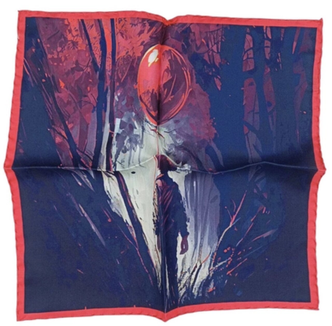
Example: The Balloon Pocket Square
Now, let’s take a look at the balloon pocket square—it’s an interesting design with a thought-provoking image. However, in our opinion, it’s not the best choice for a navy suit. The problem is that there isn’t enough red in the central part of the design, while there are too many shades of blue.
Keep in mind that when folded, a pocket square is just a small piece of fabric peeking out from your suit pocket. The full image is mostly for you and perhaps a few people who get a closer look. If you fold the pocket square in the popular puff style, the center of the design will be most visible, meaning:
- The middle part of this balloon pocket square is dominated by shades of blue, including a lot of navy.
- There’s a small hint of red on the character’s hat.
- What won’t be visible: the red balloon and the red border.
If you fold the pocket square differently than the puff style, the red border might be exposed, which could make it a better match for a navy suit—especially if you really like this particular design.
We Know What Doesn’t Work—So What’s the Perfect Pocket Square for a Navy Suit?
As we’ve established, it’s best to break up the navy color of the suit with a contrasting shade. To simplify things, we could say that any pocket square that isn’t navy or heavily blue-toned will work well with a navy suit.
Let’s also assume that you’re pairing your navy suit with a classic white shirt. If you choose a shirt in a different color, the equation gets more complex since accessories like the pocket square and tie must also complement the shirt. A white shirt, however, is a blank canvas that allows for endless styling possibilities, which is why we highly recommend it.
A white shirt is clean, elegant, and provides the perfect background for other colors. You can "paint" on it with your pocket square, tie, and even socks. We suggest coordinating these three elements into a cohesive color palette—for example, a pocket square with dominant green tones, a red tie, and red-and-green socks to create a stylish visual harmony.
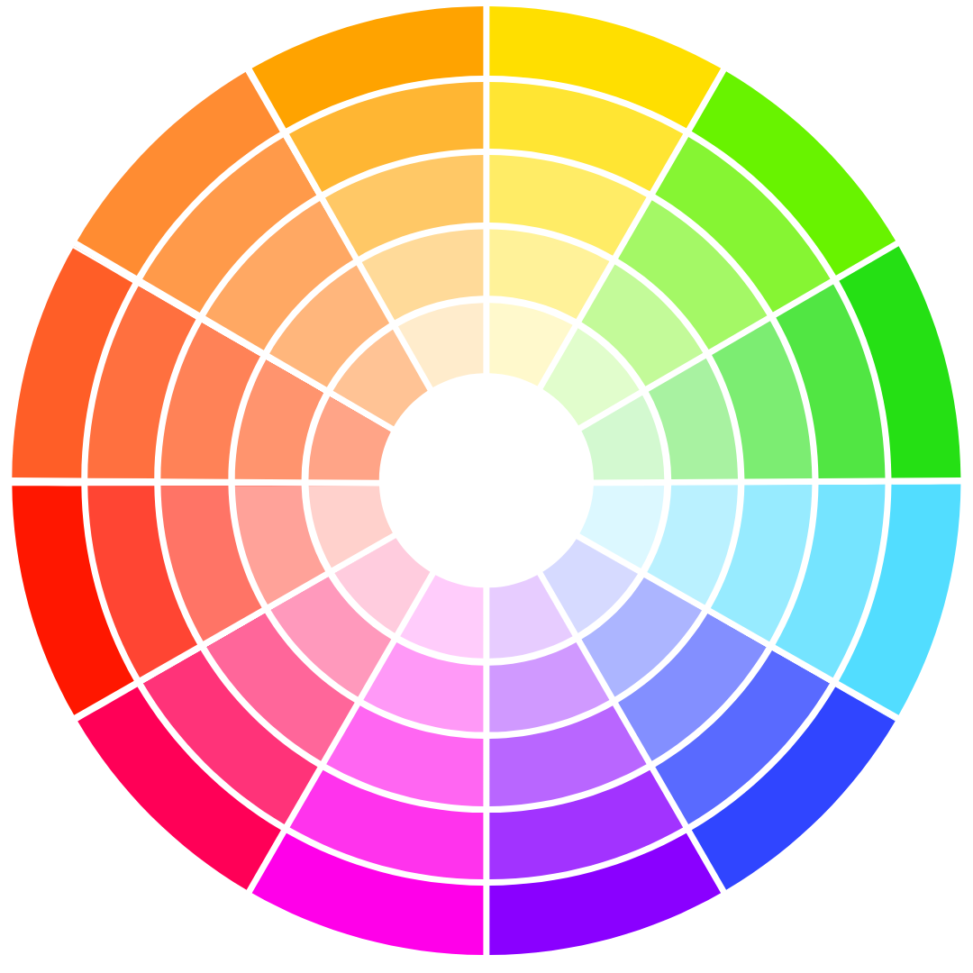
The Color Wheel: A Useful Tool for Matching Pocket Squares with Your Outfit
A red tie with a green pocket square, combined with navy—does that really work together? If you’re unsure, you can always refer to the color wheel:
- Complementary colors: Colors opposite each other on the color wheel create a striking contrast. For navy, the complementary color is orange. A great choice would be an orange pocket square or a tie with subtle orange-toned patterns.
- Adjacent colors: Colors next to each other on the wheel create harmonious combinations. For navy, this includes turquoise and purple. A pocket square featuring these shades will also be an excellent choice.
A navy suit provides a solid foundation for experimenting with colors. However, if you prefer a more classic look, you can always opt for a timeless white linen pocket square.
Also read: The White Pocket Square – 6 Things You Need to Know
Which Pocket Square for a Navy Suit? Analyzing Specific Examples
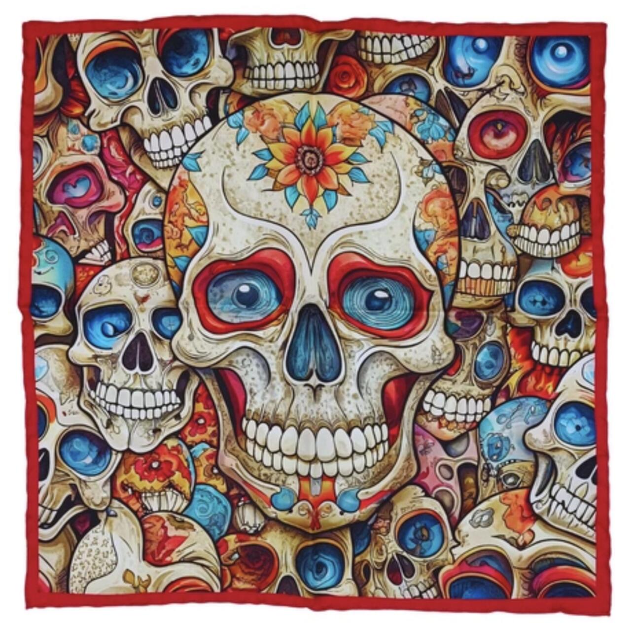
The Skull Pocket Square – A Bold Touch of Color and Pattern
This pocket square offers:
- Subtle blue accents that create a cohesive look with a navy suit.
- Vibrant red, orange, and pink elements that break the monotony of the chest area and pair well with a red or burgundy tie.
- A light and noticeable contrast against navy, with off-white details that complement a white shirt.
A great choice for adding personality to your outfit while maintaining balance!
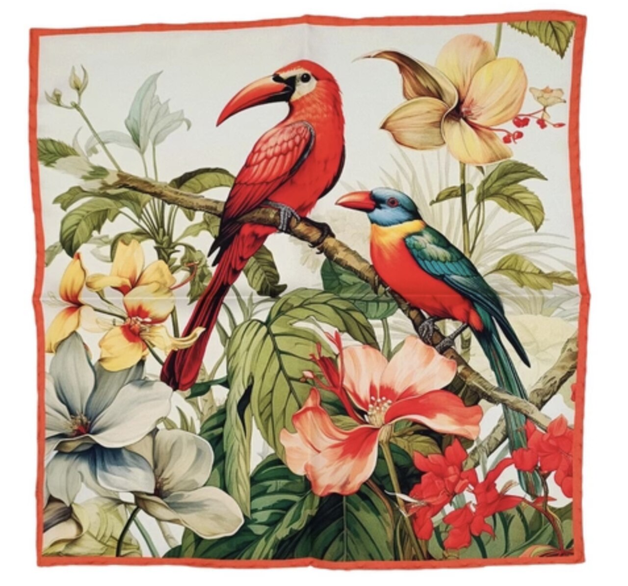
The Birds Pocket Square – Versatile and Stylish
This pocket square offers multiple styling options:
- When folded in a puff, it highlights green (leaves) and red (birds), creating a striking contrast with a navy suit.
- White background elements complement a classic white shirt.
- Featuring a blue-headed bird with a red beak, it harmonizes with a navy blazer while the red adds a bold accent. The subtle blue details act as a natural bridge between the pocket square and the suit.
- It pairs well with green, red, or yellow ties—colors that appear within the pocket square itself, ensuring a cohesive and well-thought-out look.
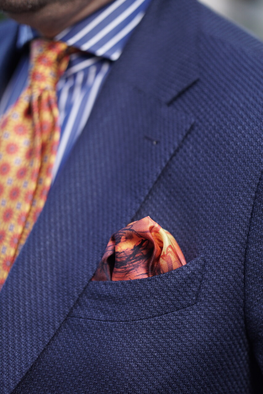
Pocket Square with a Dominant Contrasting Color
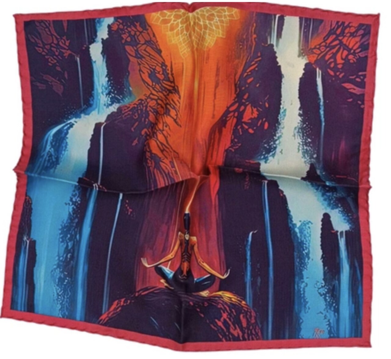
Zen Pocket Square:
- The central area features a strong orange color that transitions into red, making it stand out and adding a bold touch. It’s perfect for occasions like networking events where you’re surrounded by people in navy suits, and you want to stand out.
- Other elements (purple, navy, light blue) also pop out from the breast pocket, acting as a connector to the navy suit.
- You can pair this pocket square with an orange tie—this contrast with the navy suit is an excellent way to grab attention.
