Rules for combining patterns and colors. 11 principles and the psychology of color

Rules for combining patterns and colors. 11 inspiring principles and the psychology of color
To look good, we need to learn effectively combine patterns and colors individual elements of our closet. In today's article we will discuss in detail 11 interesting rules for combining patterns and colors together, and then we will move on to the equally interesting topic of color psychology.
After all, thanks to clothes we can not only look attractive, but also influence how other people perceive us in a given situation. We will show you some principles of combining patterns and colors with examples based on men's accessories. So, if you're looking for answers to the questions of how to match a tie with a shirt or jacket, you're sure to find a good dose of knowledge and inspiration here (of course, we can apply the following rules not only to the selection of ties or shirts, but also to any element of our outfit).
How to effectively combine patterns and colors?
1. Smooth + patterned
Let's start with an overarching principle that will allow us to feel comfortable and not wonder if we look okay. We use a plain tie if we have a patterned shirt and a patterned tie if we have a plain shirt. This is a safe combination that will allow us to play up the styling on the level of colors, not patterns. This does not mean that we cannot combine, for example, a patterned tie with a patterned shirt. On the contrary. Such combinations can look great, but we need to know a few rules, which we will tell you about in a moment.
2. The safest option possible
If we want to go easy, we can bet on a gray suit and a white shirt. That is, for items of clothing that do not have a pattern and have universal colors that go with everything. Then, no matter what color and pattern of tie or pocket square you bet on, you will look correct. Gray and white are neutral colors that allow us to not to analyze patterns and colors in our styling.
3. Same formula equals different scale
As a rule, we can successfully combine elements of styling with the same pattern, such as a shirt and tie in dots, paisley , geometric. It is worthwhile that the patterns (such as dots) on different items of clothing are of different sizes. For example, we combine a tie with small dots on it and a shirt whose pattern is dots large. This will prevent the individual elements of our outfit from merging into one uninteresting whole.
4. Different patterns equal similarity of scale
Want to connect the dots and the grid? In such a situation, we recommend using the principle of similar scale, i.e. dots as large as the grid spacing. We are not talking about sticking to the size of the pattern every millimeter here. It does not have to be the case that since the dot is 3 mm, the grating spacing must also be 3 mm. We bet on similar size, such as a difference of a few millimeters. Certainly a combination of a large grid every 10 cm and small dots of 1 cm will look bad.
5. Stay flexible
We will not always implement the above rules 1:1. Without making minor adjustments and looseness, you may end up looking too stiff, corporate and uninteresting. Going even further, sticking too rigidly to the rules can lead to absurd situations and avoidance of combinations that could fit together perfectly.
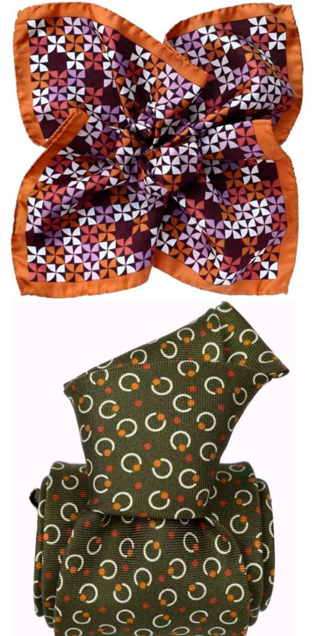
Let's take a pocket square as an example Orange windmills (on the left in the photo). We can ponder for an hour:
Is a windmill a pattern or is a square a pattern?
So which pattern to match other patterns, so that we agree on the size of, for example, the pattern on the shirt?
Are the circles on the tie the same size as the patterns on the pocket square?
Let's not get crazy in such situations. The differences are minor - such that the human eye would not catch them. Especially if we preserve personal space, and this is what happens with most relationships with other people.
We focus on the fact that we have ripped the pattern and in the next step we ripped the colors. We can see that on the tie and the pocket square we have the the same color in different shades (orange). Green and orange, green and purple, white on a tie and on a pocket square - all combinations are appropriate (We will return to the rules of color combinations in more detail in a moment).
The second situation concerns pocket squares that have large graphics. Here we will not follow the rules of combining patterns, because the pocket square will be visible only partially (after folding the pocket square, only we will know what the whole pattern looks like).
Therefore, in pocket square with large graphics, we will not apply the rules of combining patterns, but colors. For an example, take a look at the Wizard's pocket square:

Sorceress consists mainly of orange, pink and purple, but the pattern is large enough that it will not be superior. So we can't focus on the principle of linking patterns together. We are interested in matching the tie to the color scheme of the pocket square (the part that will be visible).
6. Inspiration in nature
Let us now deal more broadly with the principles of color combination. Let me give you a real-life example. I once dressed in green and brown, and a colleague pointed out to me that it did not look good. I replied that, after all, all trees are a combination of browns and greens. Don't they look good? How can it not fit together? After all, it must fit, since it occurs in nature.
The above story shows that if we do not know how to combine colors, it is worthwhile to be inspired by mother nature. What joints look naturally good? Take for example:
- Blue sky and green tree
- White/gray clouds and blue sky
- Black and yellow - bee
- Yellow and blue - sun and sky, sand and sea
- Orange and blue/green - amber with water
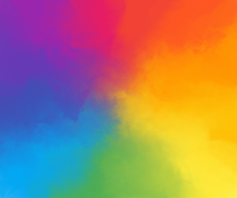
Rules based on the color wheel
Another great help, right after nature, can be for us the so-called color wheel. So let's take a look at the rules for combining colors based on it.
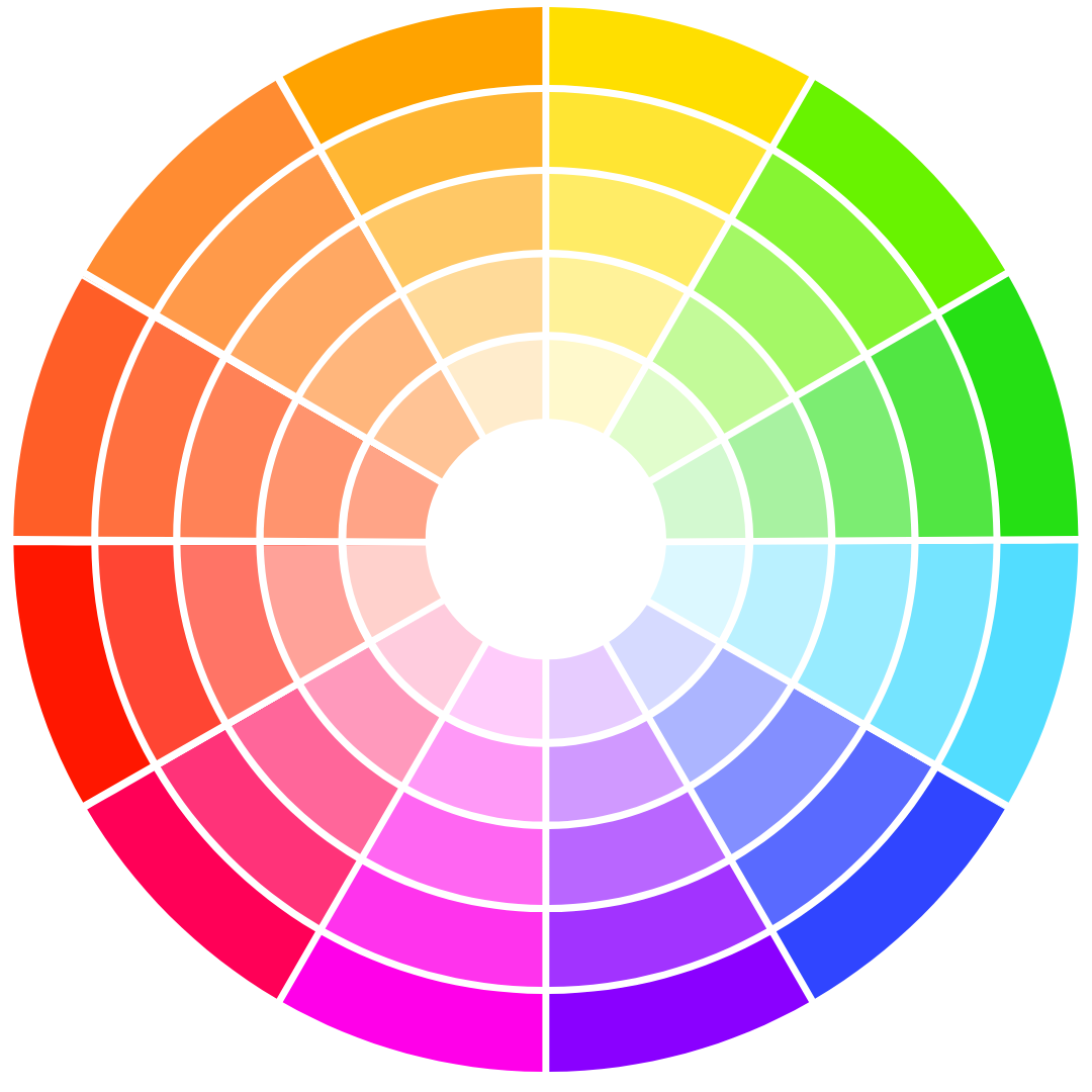
7. Contrasting colors
Combining colors that are opposite each other on the wheel is a basic principle. These types of colors are called contrasting colors or otherwise complementary colors. As the name suggests, these colors naturally complement each other. What are the advantages of such a color combination?
- contrasting combinations are eye-catching, energetic and enliven the styling,
- despite the contrast, the colors harmonize perfectly with each other, which makes the styling balanced.
Examples of complementary color pairs include. yellow and purple, red and green, blue and orange.
8. Adjacent colors
Adjacent colors are located side by side on a circular color diagram. They are interrelated, so using them in styling looks natural and consistent. Adjacent colors are more subdued than combinations of contrasting colors, so the whole styling will look more subtle.
Examples of adjacent colors include. blue and purple, red and pink, green and yellow.
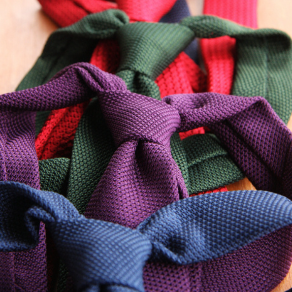
9. Monochrome colors
Monochromatic colors are located along the radius of the color wheel. In other words, they are different shades of the same color. The use of monochromatic colors in styling has several advantages, such as the ease of combining, full harmony and aesthetics without having to think about whether it's for sure.
Examples of monochromatic colors include. navy blue and blue, various shades of gray or brown.
10. Split colors complementary
The split complement colors are three colors - the first color and two colors that are on opposite sides of the circle from the first color. They form the letter T. It will be e.g. purple + turquoise + orange or cred + blue + green.
With such combinations we can get very interesting contrasts. This tactic of combining colors, moreover, provides ample opportunity to experiment and create original styling.
11. Colors double complementary
Double complement colors are a combination of 4 colors. Otherwise known as opposite color pairs. One example of double complementary can be the combination of colors blue, yellow, purple and orange.
Blue and yellow are at opposite ends of the color wheel, and purple and orange are directly next to these colors. In this arrangement, blue complements orange, and yellow complements purple.
Color psychology
Color psychology is a field that studies the effects of colors on behavior, emotions, and people's perceptions. It plays an important role in fashion, because the color of clothes can affect the way people are perceived by others. This often happens at the unconscious level.
Colors can be a way to attract and win over people in your personal or business life. Depending on what stage of life we are in, where we are working, what we want to achieve, we can fit clothing that will help us. And even if it doesn't help us, it shouldn't bother us.
Why you should know the meaning of colors?
Let's take an example situation where you are wearing a navy blue suit and a white shirt. A green tie, blue tie, gray tie, red tie and plenty of others will go with such a set. However, depending on our choice, we can make a certain impression on others.
Suppose you are in a business situation and you are wearing a watch. You can check the time on your smartphone and many other places. Consequently, we do not wear a watch for its primary function. We wear it to impress, to favorably influence styling or, finally, to show that we can afford a certain model.
The same is true for colors. They matter, and it is worthwhile to start using them in a conscious way to achieve certain results.
Suppose two candidates with similar qualifications apply for a job. One of them is hopelessly dressed, and the colors and patterns found on his clothes don't match at all. The second candidate has a great color-coordinated, interesting grenadine tie. In such a situation, the latter's chances of getting a job increase. Of course, if someone is well-dressed and has nothing to say, good styling will be of no use.
And here again we return to the principle we recommended - clothing should not bother us and we can count on the fact that in certain situations it may help us.
Red color
The color red symbolizes passion, energy and confidence. In fashion, it is a color often associated with the courage to stand out from the crowd. So a red tie can be a great choice for a date, for example. It is not advisable to use it in excess (e.g., red suit and red accessories), as it can cause anxiety and aggression.
Orange color
Orange is an energetic, warm and friendly color. In fashion, it can symbolize joy and enthusiasm. Certainly, like the color red, it helps you stand out. Looks good regardless of the season. In addition, the orange color is associated with competence, which can help build a good image in business.
Yellow color
Yellow is a symbol of optimism, joy and friendship. It attracts attention and adds to the positive mood. It will be a great choice for summer (it goes well with the blue sky and the sun). Yellow is a breath of freshness and youth, which allows you to show an open disposition and build a cheerful image.
Green color
Green is the color of nature, harmony and peace. Undoubtedly, it is associated with spring, freshness, as well as ecology. It is also considered a color that soothes the senses and relieves stress. Choosing a green tie or pocket square will certainly have a positive effect on your interlocutor. The shade of bottle green looks elegant, luxurious and classy.
Blue color
The color blue evokes calmness, stability and confidence. It is widely regarded as a classic and elegant color. It is also associated with seriousness and professionalism. Therefore, it is readily chosen in business situations, especially in professions that are supposed to be associated with stability and social trust.

Purple color
The color purple makes the styling feel luxurious, mysterious and even spiritual. It is associated with wealth and elegance. It is also considered a soothing and relaxing color. It is worth keeping in mind if you are preparing styling for a romantic date.
Pink color
The color pink is a symbol of romance, sweetness, personal charm and delicacy. Especially if we are talking about powder pink. In the intense version, it is associated with high energy and determination. It will be great for avant-garde men who do not like boredom in their styling.
Brown color
Brown symbolizes earth and naturalness, so it can be used to express stability, warmth and tranquility. It's very easy to combine it with other colors, and it's worth doing so to create the effect we want on other people.
